
TelePresence Ecosystem for Healthcare Professionals

TelePresence Ecosystem for Healthcare Professionals
The early-stage startup develops healthcare solutions using augmented reality (AR), artificial intelligence (AI), and Internet of Things (IoT) technologies.
Their main product, Smart Glasses, enables real-time remote medical assistance, connecting healthcare providers with experts regardless of location.
They also offer a remote patient monitoring platform and a cloud-based patient follow-up portal, all enhanced by AI and machine learning.
Overview

Team
My role: UX/UI Designer
Team: UX Researcher, CEO, Developer, Director of Innovation and Technology
Duration: 6 weeks
My role
I worked as the UX/UI Designer on the design team. My responsibilities included conducting competitive analysis, performing user interviews,
facilitating usability testing, and synthesizing research findings. I collaborated closely with team members to ensure smooth communication
with the client and efficiently delegated tasks. In the design phase, I focused on creating user-centric designs and developing interactive
prototypes to enhance the overall user experience.
Problem
Healthcare professionals dedicated to patient care often struggle with technological distractions and inefficiencies caused by complex
navigation and unclear interfaces can negatively impact the technology's ability to improve patient outcomes.
Our client facilitates real-time medical guidance, support, and collaboration for clinicians, regardless of their physical locations. As healthcare
professionals prioritize patient care, they need technology that is seamless and distraction-free. The client seeks to improve the visual design
and user experience of their telemedicine conferencing platform.
Due to copyright considerations, actual logos and company names have been replaced with a placeholder logo and the name Iris.
Solution
Crafted responsive and interactive designs to increase user engagement and streamline navigation, making interactions smoother and more intuitive.
Additionally, added new features, improved UI elements, and enhanced accessibility.

Outcome
We seamlessly integrated new features and functions through research and testing to ensure a more user-friendly experience. I gathered qualitative feedback through surveys to measure user sentiment regarding our redesign. Quantitatively, task completion rates have increased due to the implemented changes.
Project Plan
The primary objective was to refine the interface of a single video call page, with an emphasis on UI elements and the overall look and feel.
Due to time constraints, we decided as a team to remove information architecture and personas from our deliverables and concentrate entirely on the UI.

Competitive Analysis
Analyzed how two indirect competitors address similar business challenges. Our product's objective was to enhance functionality and intuitiveness.

Elements to incorporate into our designs
Effective Organization: Utilized sub-menu options for better organization.
Bottom-Stationed Menu Bar: High-priority action items are included in the bottom menu.
Color Accessibility: Ensured color accessibility and clear labels for iconography.
Intuitive Layout: Maintained a simple and intuitive layout for universal usability.
Design insights to integrate
Structured Organization: Leveraging submenu options for effective organization.
Key Action Items: Including a bottom-stationed menu bar with high-priority action items.
Clear Iconography: Ensuring color accessibility and clear labeling for icons.
User-Friendly Layout: Design intuitive layouts while maintaining simplicity for universal usability.
Exploratory Usability Testing
Objective: Exploratory Usability Testing at the early stages of design allows us to evaluate the existing product and discover common user pain points.
We tested participants on the call platform.
User’s expectations of the site.
User’s ability to distinguish between elements of the page.
User value of the functions the site presents.
Approach: The test script focuses on giving tasks to allow participants to explore the interface of the meeting room call page.
1-on-1 testing with five participants.
Affinity mapping for data analysis.

Tasks
Initiate a call on the platform
Navigate and switch between layout options
Adjust settings for each screen
Open the chat box and send a message
Upload and share an image
Common pain point


Affinity Mapping

Competitive Analysis & Exploratory Usability Test Summary
Effective Organization: Utilize sub-menu options for better content organization.
Bottom-Stationed Menu Bar: Include high-priority action items in the bottom menu for easy access.
Color Accessibility: Ensure color accessibility and provide clear labels for iconography.
Intuitive Layout: Maintain a simple and intuitive layout to ensure universal usability.
Responsive Design: Optimize the interface for various devices and screen sizes.
Design & Development
Sketching and wireframing

Sketching
I conducted a rapid sketching session, creating eight variations of the most critical screen in 8 minutes, dedicating 1 minute per page. Through focused ideation, I finalized the design of the screen. During this session, I considered the environment in which users interact with the product. For example, an EMT could treat a patient on-site by connecting to a wound specialist, using SmartGlasses to stay hands-free. The specialist could remotely control functions like turning on the flashlight, zooming in and out, capturing images, and providing real-time guidance to the EMT.
I realized that the redesign should enable users to complete tasks more efficiently while maintaining all existing interface functions.
High-Fidelity Mockups & Prototyping
Accessibility: My client's existing style guide specifies the required font (Century Gothic) and color palette. Before starting any designs,
I ran the palette through a color accessibility test to ensure the color combinations would be universally accessible.


Deliver
Midpoint check-in:
Our team has weekly progress update meetings with the CEO in the initial half of the project. At the midpoint check-in meeting to hand in our
HIFI mockups and prototypes, we had a meeting with the Director of Innovations & Technology. He’s given us further information on
the product about required layouts and aspect ratios that’ll require some significant edits to our prototypeI informed the Director of the project's time constraints and proposed to focus on editing the prototype in the final week instead of
usability testing. Our team and client agreed to change the project scope for the last week.
Final Prototype


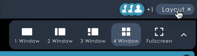
We’ve added an option to allow the layout menu to be stationed if needed so the user can experience different layouts without having to click around too much

We moved the stationed menu bar to the bottom as well as reorganized low priority items to sub menus, and all elements are responsive
Summary
In our final handoff, our team provided a week of buffer time for the client to review the delivered final product and request any minor changes. All assets and deliverables are shared in a central drive.
For ongoing product enhancement, we’ve communicated additional insights to the client, including:
Assessing the utilization rates of individual menu items
Exploring opportunities to streamline functionality without compromising effectiveness
Conducting further testing to determine the optimal layout for various scenarios
Ensuring an enhanced user experience across all interactions with the product
Options for further support:
Offering additional training sessions for the client's team
Providing a dedicated support channel for any post-launch issues
Scheduling periodic check-ins to gather feedback and discuss potential improvements