Website design case study
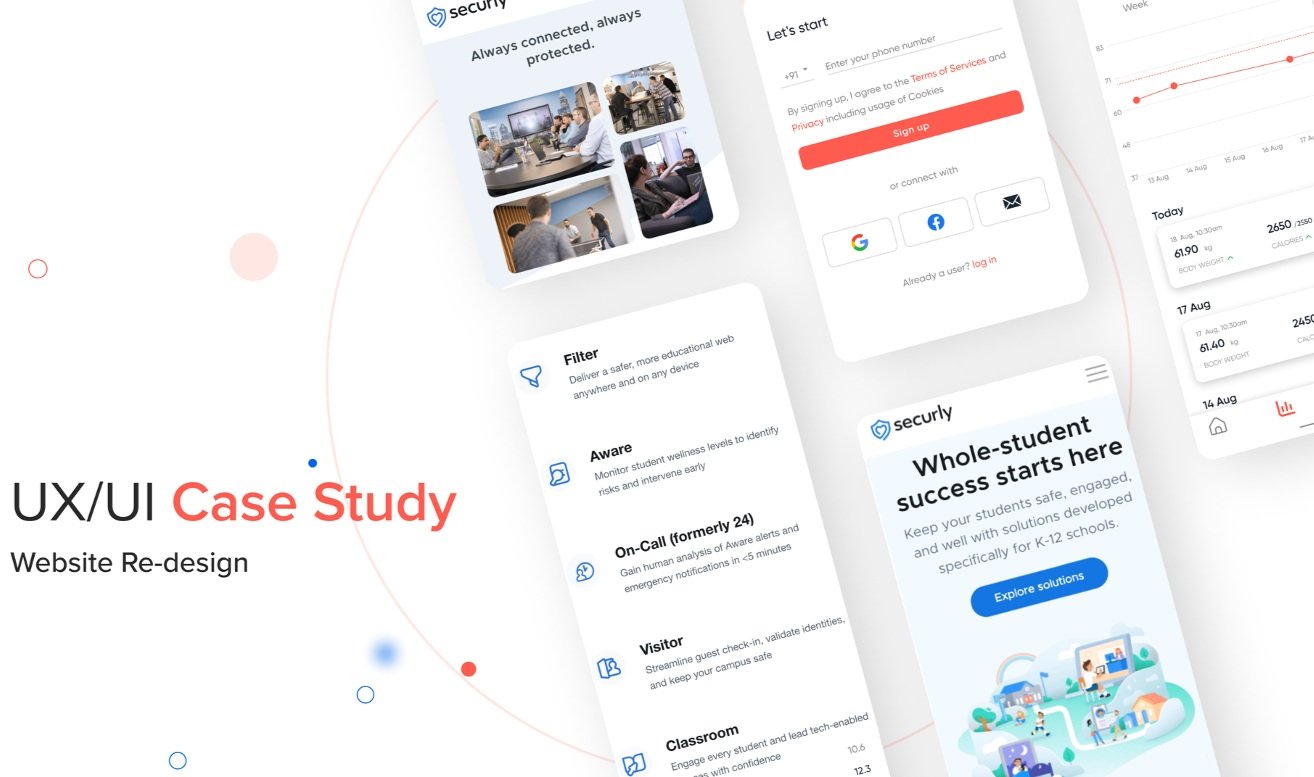

Website design case study (Securly)
Background:
Online safety helps protect children from potential dangers such as cyberbullying, exposure to inappropriate content,
and potential threats from external sources. It safeguards their emotional well-being, privacy, and physical safety.
Here are some key aspects of online safety for kids in schools:
Internet Filtering and Blocking
Cyberbullying Prevention
Privacy and Data Protection
Digital Literacy and Online Safety Education
Reporting and Support Mechanisms
Overview:
Securly's solutions are typically cloud-based and can be easily integrated into existing educational technology systems.
The company aims to provide user-friendly interfaces, seamless deployment, and ongoing support to ensure a smooth
implementation for schools and districts. The company's primary focus is on creating a secure and productive online learning
environment for students.
Securly offers a range of products and services designed to protect students from online risks:
Content Filtering and CIPA Compliance
Student Safety Monitoring
Classroom Management and Device Control
Parental Engagement
Analytics and Insights
Design brief and my role:
As a senior UX/UI designer, I was tasked with redesigning various consumer-facing pages for Securly, including
the mega menu, the home page, product pages, blogs, about us, the career page, forms, and more. The goal was to reinforce Securly's
core business values in a highly competitive environment where a strong digital presence is essential. This is the story
of our 6-month journey as designers to reimagine the old website for the big corporate Securly Inc.
“So, how can we design strong collaboration and communication between parents, and educators,
using the Securly platform to create a comprehensive support system for student safety? “
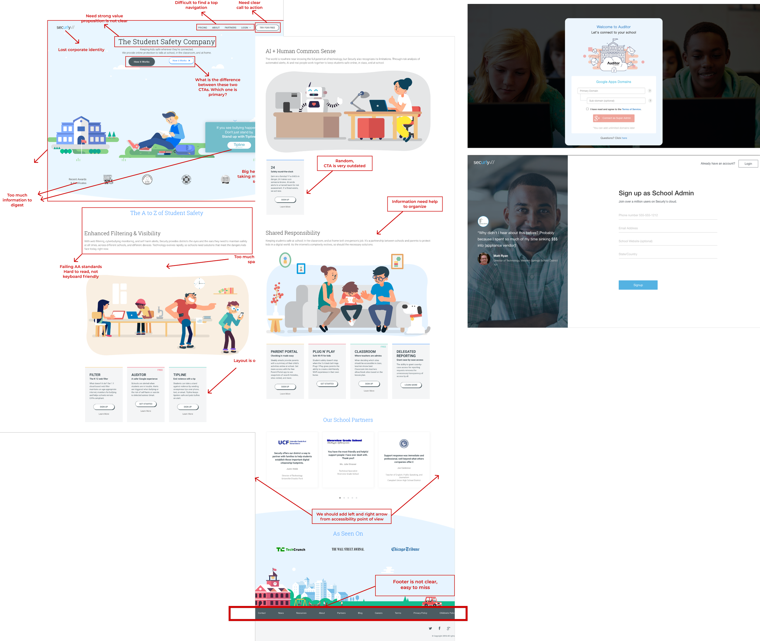
Problem statement
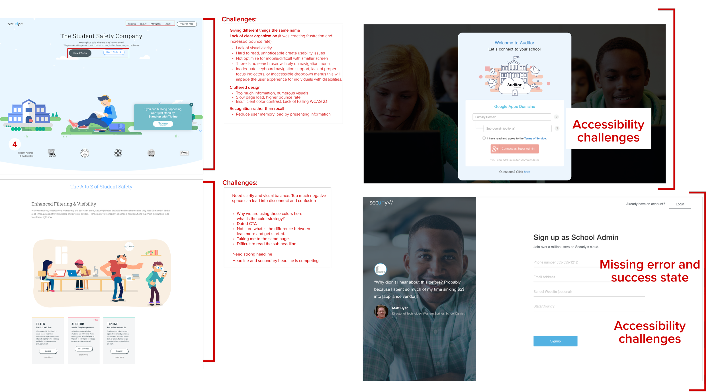
Securly's website fails to meet its business objectives because it is unresponsive, slow, and does not effectively
communicate the company's directives. As a result, users do not understand what Securly does
or what its principles are and, therefore have no reason to sign up.
Hypothesis:
Implementing a user-centric and visually appealing design, optimizing the user experience, and showcasing Securly's unique
value proposition, the redesigned website will attract more qualified leads, improve user engagement and retention, and ultimately
drive an increase in conversions and revenue.
Research
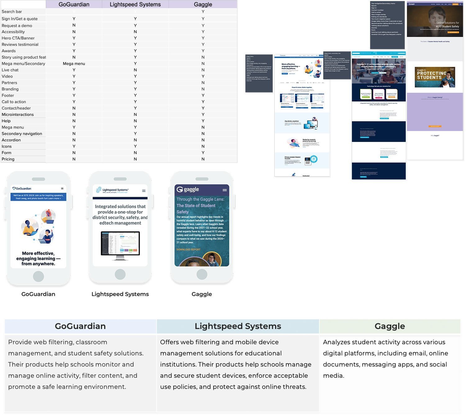
Competitive Analysis: Comparing different features from direct competition. My goal was to compare and identify
common features across these sites and potential opportunities for student safety to differentiate.
The most important takeaway from this activity was learning how different websites organized their content, products,
solutions, and overall. This was helpful information that helped solidify the stage for my second phase of research.
SWAT Analysis


Interviews and workshops
Interviews, design workshops, and surveys were conducted with stakeholders to identify common pain points and gather suggestions for enhancements.
–What are the strengths and weaknesses of our current website?
–What are the areas that need improvement?
–Reviewed our website's traffic, bounce rate, conversion rate, page view, and other metrics.
This helped us to identify the areas where our website is falling short. Created surveys to collect feedback from users who had implemented Securly's solutions. Gathered feedback on specific features, navigation, and overall ease of use.
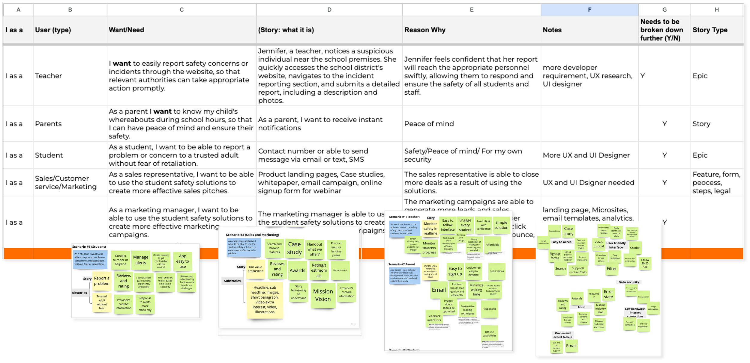
User stories

User personas
Information gathered from the interviews also contributed to the development of User Personas, which represent the specific
types of individuals identified through research as potential users of Securly. Based on the user personas, I identified the primary
user needs that we aimed to address in the design, while also considering the needs and goals of our business.
The primary needs we identified were:
1. Clear product organization
2. Product search
3. Helpful product suggestions
4. Detailed product information
5. Product reviews
6. Product videos.
User journey

Information Architecture
The next step was to develop the navigation system by conducting a card sort, a user research technique to tap into people’s
existing mental models. For this project, I was given a list of product offerings and solutions, contacts, and support to use
as a guide. It was essential to organize this information clearly and understandably so that site visitors could find
the products they were looking for. Our primary objective for this project was to incorporate product and service offerings,
ensuring their seamless integration. To achieve this, it was crucial to organize the information in a manner that is both clear and easily comprehensible, allowing site visitors to effortlessly locate the specific products and solutions they are seeking.
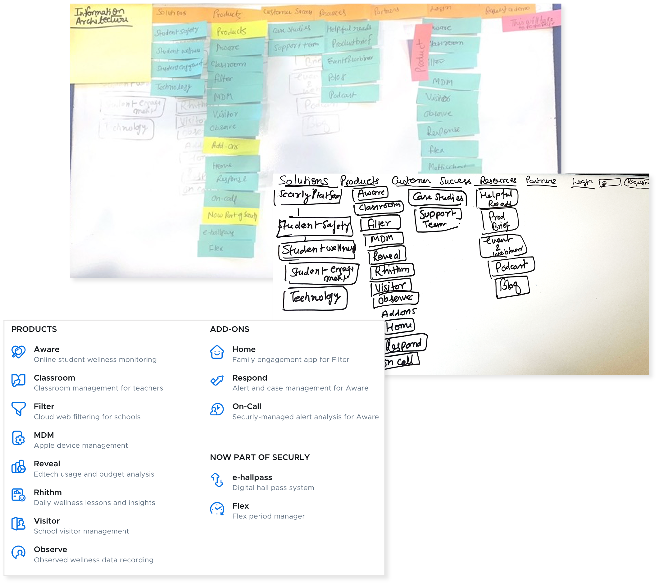
Card sorting
-Open Card Sorting: I asked 6 participants to organize the 13 products into categories that seemed the most logical to them.
Then I had them label each of those groups with titles they felt accurately described the items in that category.
-Closed Card Sorting: Based on the results of the open card sorting, I created 3 predetermined categories from
the most common group labels. Then a closed cart sort where a group of 4 different participants had to sort the items
into these predetermined categories.
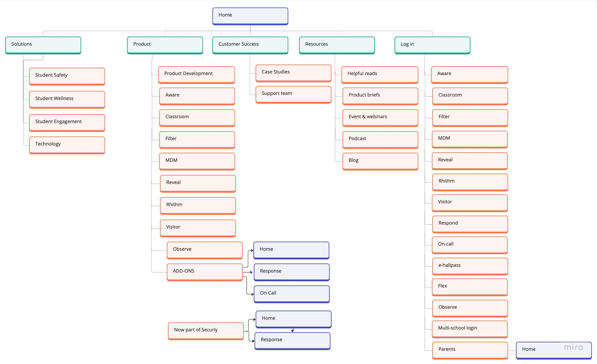
Site Map:
This was to ensure that products were going to be placed where users would expect to find them when visiting the website and make the experience more intuitive.
The overall structure of the website:
With the results of the card sort and inspiration from other competitor websites, I created a site map to define the overall structure of the website.
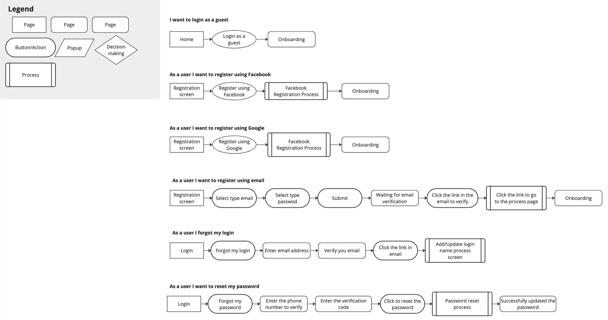
User Flows
The next step in my process was to develop the navigation system and onboarding. I conducted a card-sorting
exercise, a user research technique that taps into people's existing mental models. This helped me to understand how users
would expect to interact with the system and how I could best structure the onboarding experience.
Development phase
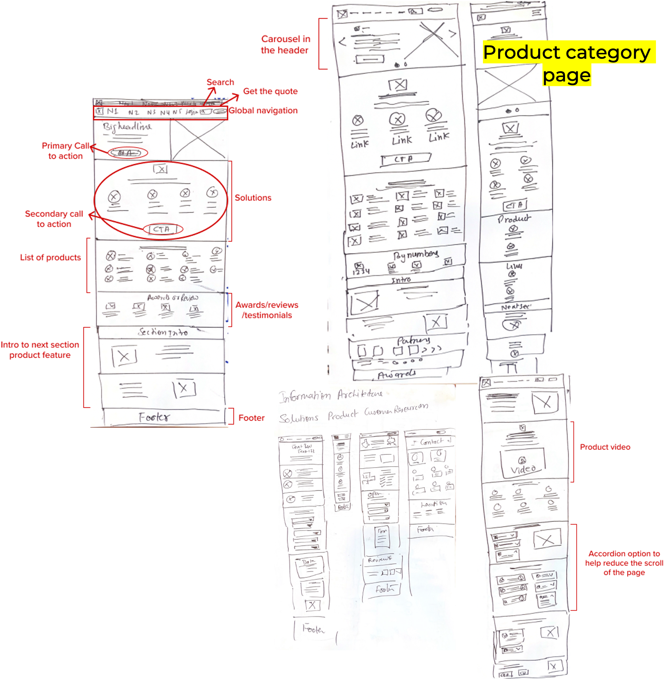
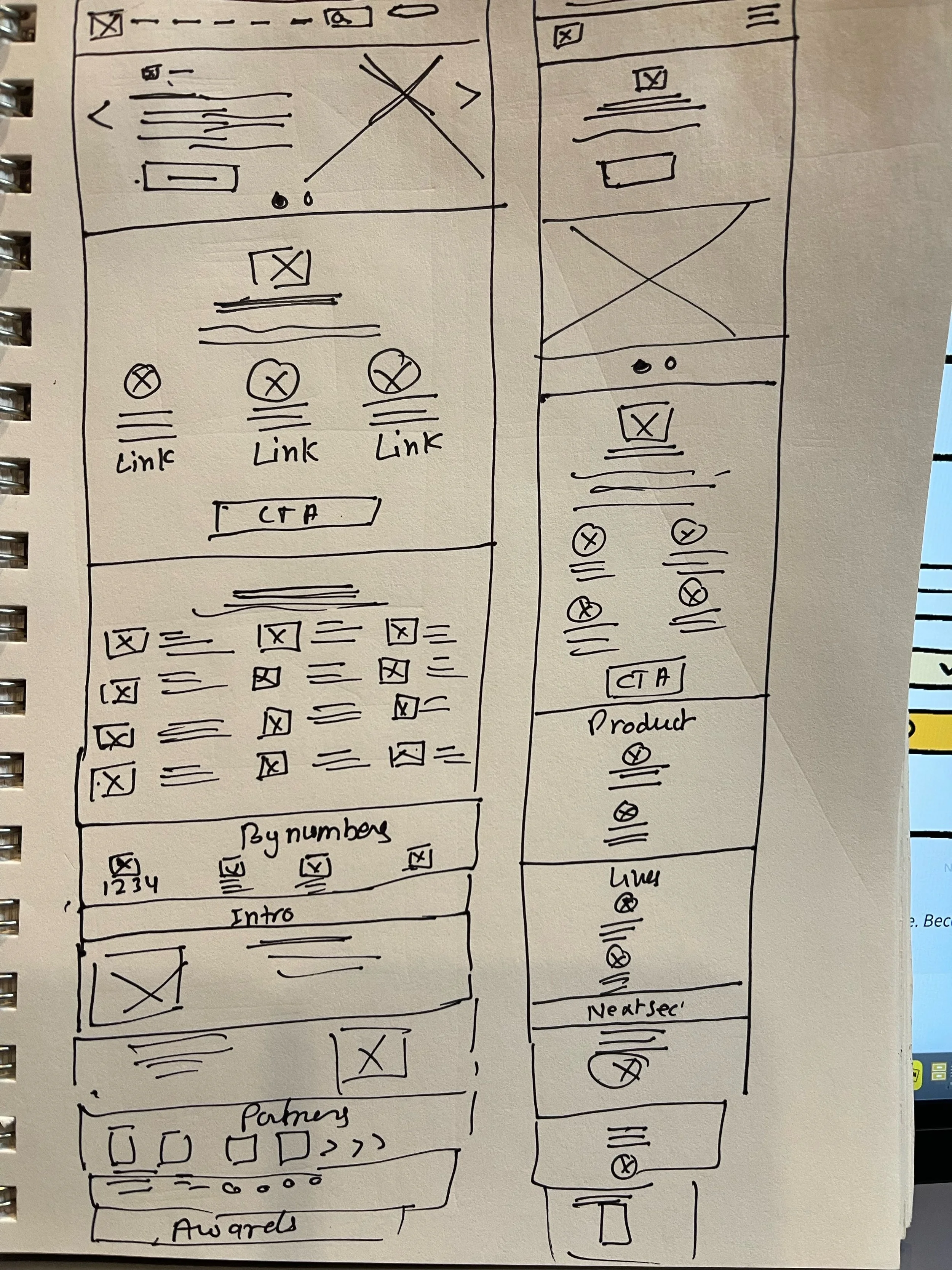
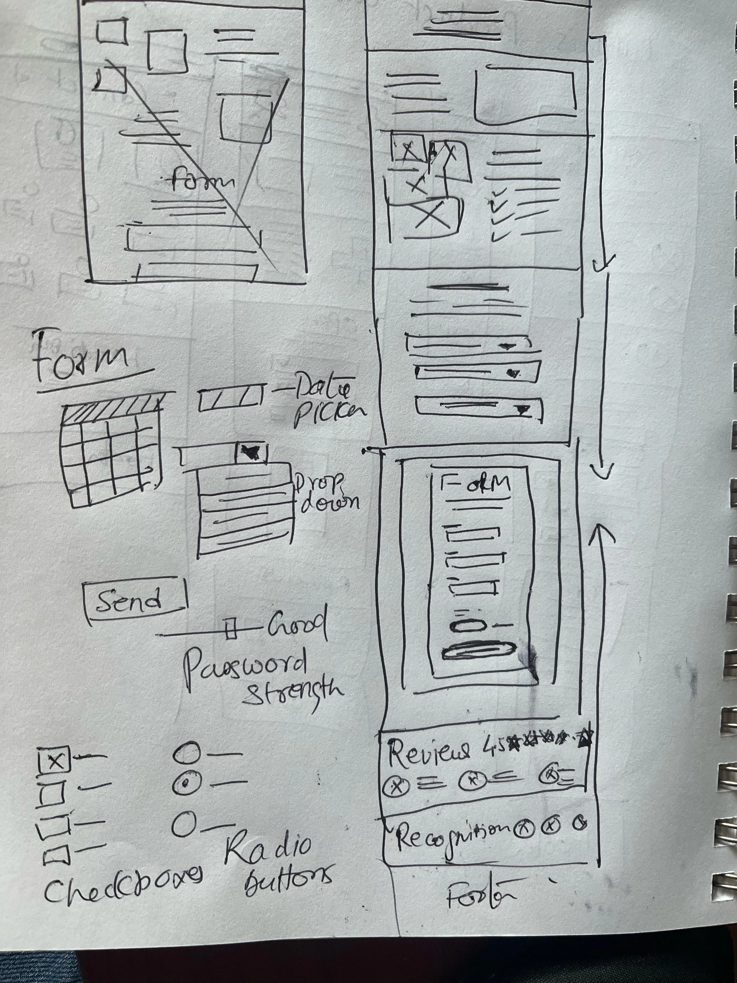
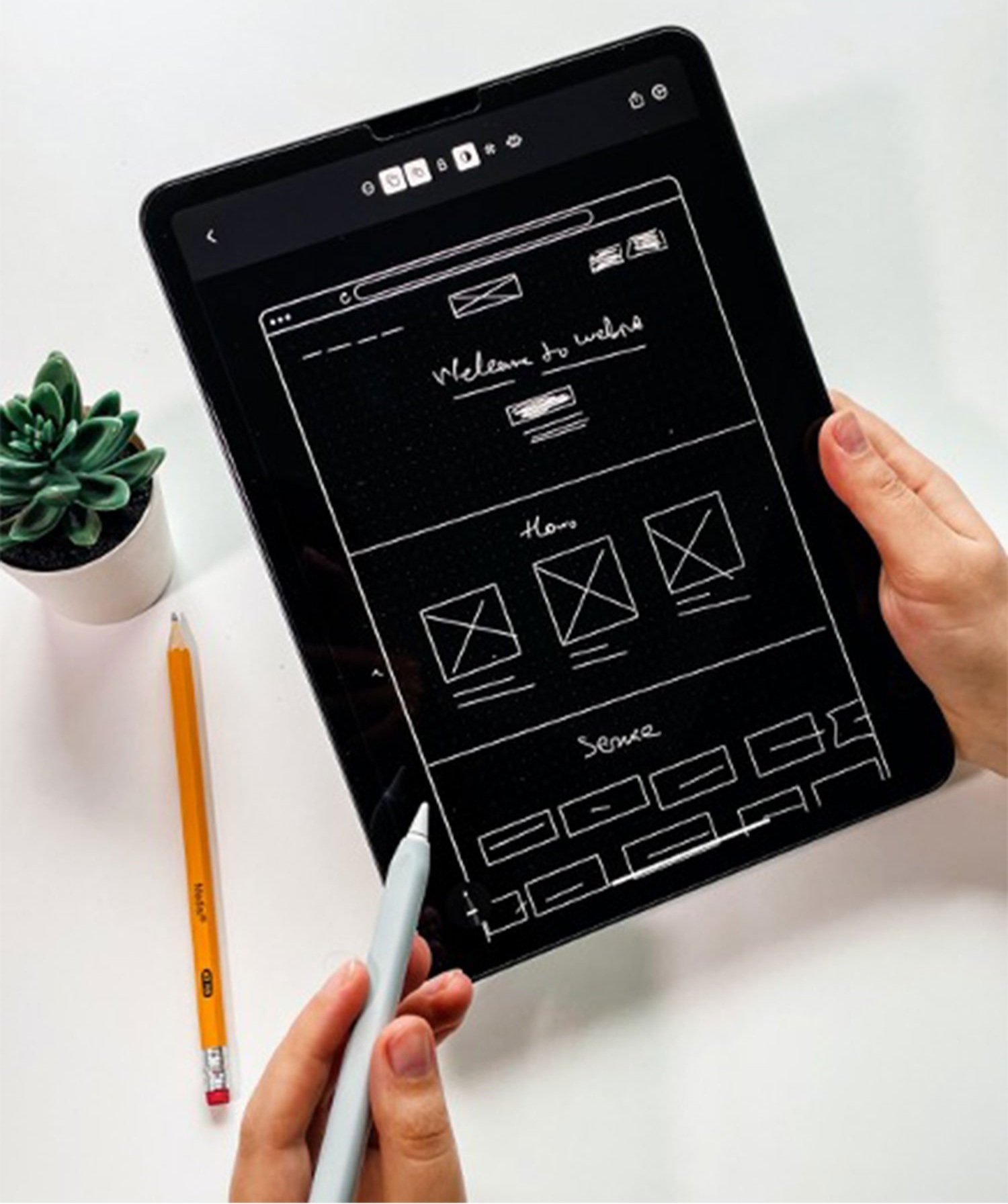
Sketching
Once I organized all my insights from the exploration phase, I began to design the website. To start this process, I began
to sketch several of the site’s main screens, using my user flows as a guide. This allowed me to quickly explore several concepts
for the website layout. I then tested this with 3 participants to validate whether these solutions addressed both the user and business needs.
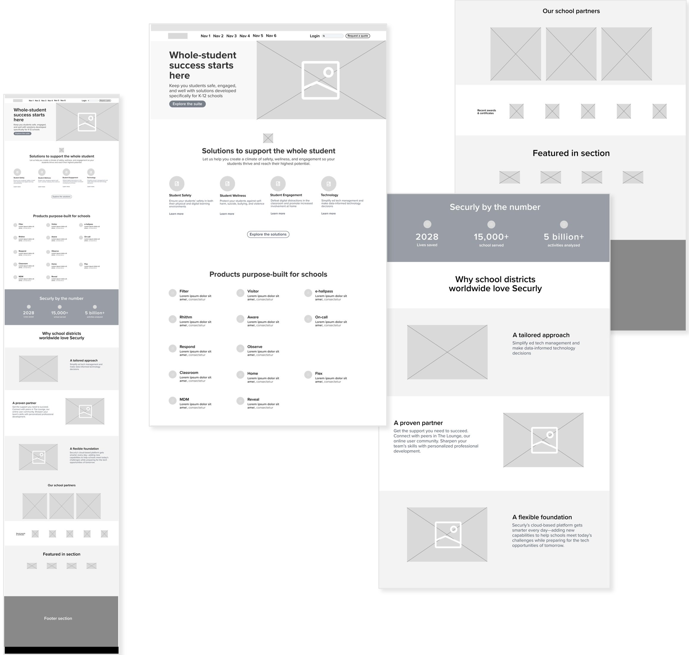
Wireframing
Based on the feedback and personal insights I learned from the sketching phase, I began to design my first wireframes.

User needs:
1- Clear global navigation.
2- Product and services search field.
3- Request a quote link.
4- Clear value proposition.
5- Effective primary Call to Action.
6- Engaging imagery.
7- 2nd section talks about how can we help you with our solutions. Talking about support/help/wellness/safety.
This will help create engagement.
8- Clean organization, image, subhead body copy, link. Click on the link to explore one solution at a time.
9- Click on the secondary button and explore the complete suite.
10- Clear headline talking about our product goal/purpose. All our offerings are organized in one place.
11- Gain confidence and engagement.
12- Set the tone and engage users in what is coming into the next section.
13- Storytelling with product offerings.
14 Build credibility (help in decision-making).
15- Social proof, trust, company accomplishments, positive media coverage.

Homepage prototyping (versioning and feedback)
To keep users from feeling overwhelmed, I designed a clean and simple homepage. To help them easily find products, I included
global and secondary navigation menus, as well as a search bar.
Testing
Usability testing
Once I completed my wireframes, I created a prototype of my website to begin usability testing. This would allow me to evaluate how users would engage with the proposed website solution and validate whether it was addressing the primary user needs. It was important to test with mid-fidelity, greyscale wireframes to gather honest, critical feedback from potential customers and to solidify the functionality of the website before addressing the visual design.
User needs
Clear global navigation, accessible using a keyboard.
Search function, the field has enough padding. Designing for touch “request a demo” secondary CTA, hit the target is 44 px.
Carousel:
- Indicate the carousel slide the user is currently on. Slide label next to prev.
- Carousel to auto-advanced 5-7s, click to pause a carousel if it’s auto-advanced.
- Ignore auto-advancing on mobile. Add how many slides the carousel contains.
- We did AB testing using thumbnail images vs. gray dots but didn’t get a good response.
- Make sure to measure CTR for each slide.
- Clean organization, image, subhead body copy, link. Click on the link to explore one solution at a time.
- Helped to communicate our value proposition.
- The primary call to action stands out prominently, making it hard to miss.
- All interactive elements, including functionality, hover, selected, focused, and clicked states, maintain a unified
color scheme. Whether it's the primary call to action, secondary CTAs, links, or the carousel slider,
all actions share the same color, creating a harmonious visual experience.
Approved wireframe
Home page (before)

Home page (after)
I wanted to emphasize the importance of the customer-brand relationship by incorporating
-Visual appeal: High-quality images, and a consistent color scheme that aligns with our brand’s tone and personality.
–Clear Brand Messaging: Communicated value proposition.
–Persuasive copy: Conveys what sets your brand apart, its core values, and how it solves customer problems or fulfills their needs.
–User-Friendly Navigation: Ensure that the home page has intuitive and easy-to-use navigation.
Use clear headings, labels, and menus to guide visitors through your website and make it simple for them to find the information
or products they are seeking.
–Social proof and testimonials: Reviews, ratings.
–Call to action: Clear and compelling calls to action strategically on your home page. Use persuasive language and visually
prominent buttons to guide visitors toward desired actions, such as signing up.
–Responsive design: Followed the Responsive Web design approach that suggests that design and development
should respond to the user’s behavior and environment based on screen size, platform, and orientation.

Enhancements implemented in the design of our product pages
Upon selecting a product from either the top navigation product category or the purpose-built selection for schools, users will be directed to the product page. We have taken care to offer comprehensive product descriptions and video presentations highlighting advantages, ensuring that users can thoroughly assess whether the product aligns with their specific needs.
Items on my checklist:
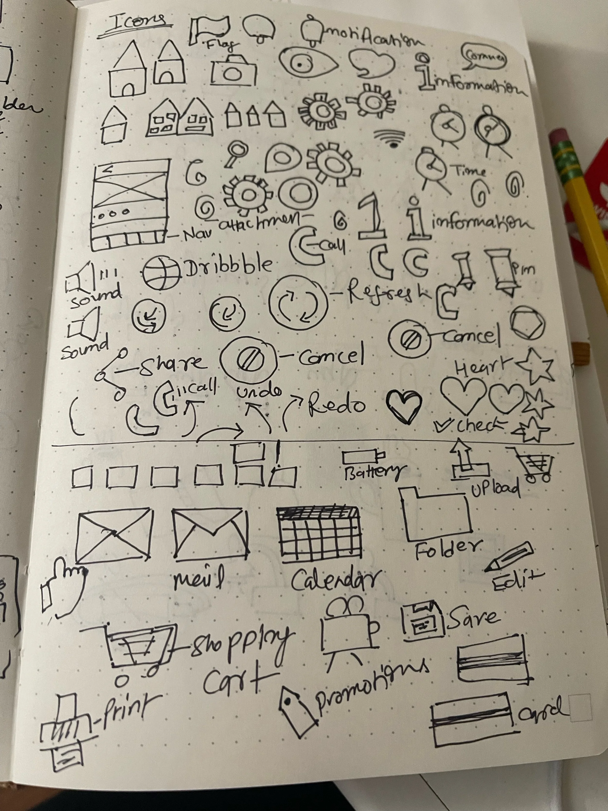
Which icon should we use to signify expansion?
How do we visually indicate collapse/expanded states?
Should the icon be positioned on the left, inline, or on the right?
By default, should all sections be collapsed or open?
What happens if a user clicks on the category link?
What is the expected behavior if a user clicks on an empty bar?
Should the expanded section collapse automatically?
What if there isn't enough space to display all items?
Is it necessary for the accordion to contain a link to the category's main page?
Should the user be scrolled automatically when a section is expanded
Do we include the "expand all / collapse all" functionality?
Do we maintain the state of an accordion on reload?
Post-Launch Evaluation:
We employed various analytics tools, such as Google Analytics, to capture website data and user behavior metrics. This encompassed details on traffic sources, page views, conversion rates, bounce rates, and user demographics. Additionally, we incorporated qualitative insights through user feedback gathered from surveys and feedback forms.
Our focus centered on analyzing key performance metrics to gauge the website's effectiveness. We delved into traffic trends over time, comparing data from pre-launch to post-launch. Evaluation of conversion rates and bounce rates helped us assess the website's ability to engage and convert visitors. Following the website redesign, we observed a notable improvement in conversion rates. The newsletter sign-up conversion rate increased, with 4.5 visitors subscribing.
